Brand architecture
Our brand architecture dictates how units within the university relate to the main brand and each other. The architecture consists of four easy-to-follow rules. This policy is binding: all organisational units must communicate within the guidelines of our university brand architecture.
The four rules:
1. One logo for a strong brand
- Utrecht University uses one logo; that of Utrecht University. This logo has a Dutch and an English version.
- Personal logos for university units are not allowed.
- All Utrecht University communication features the Utrecht University logo – the Dutch version with Dutch text, the English version with English text.
- All communication uses the Utrecht University colour palette and typography.
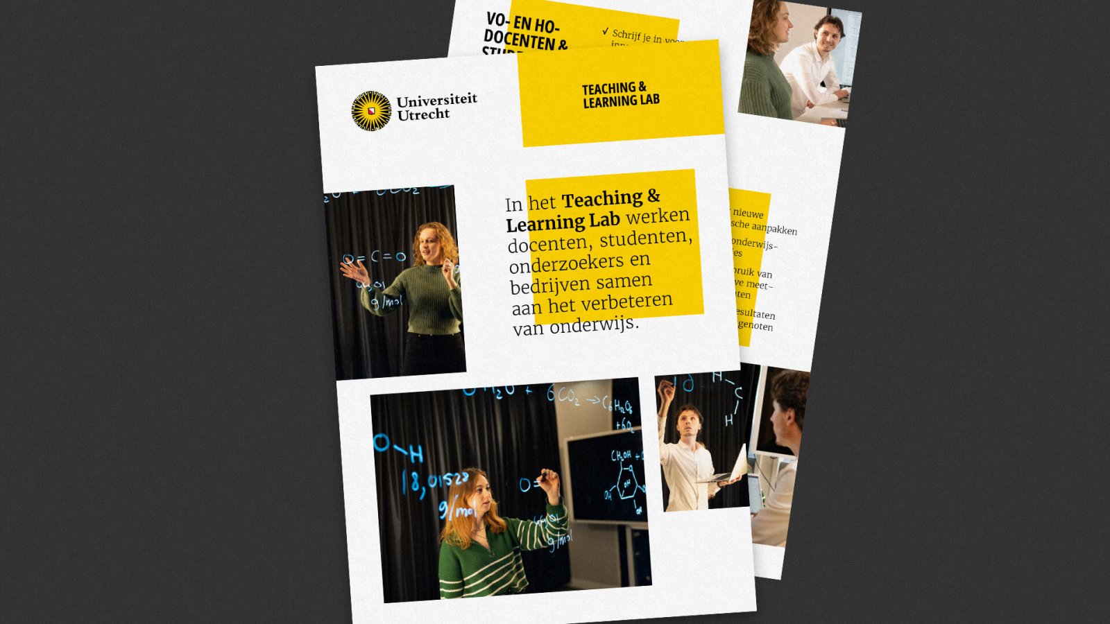
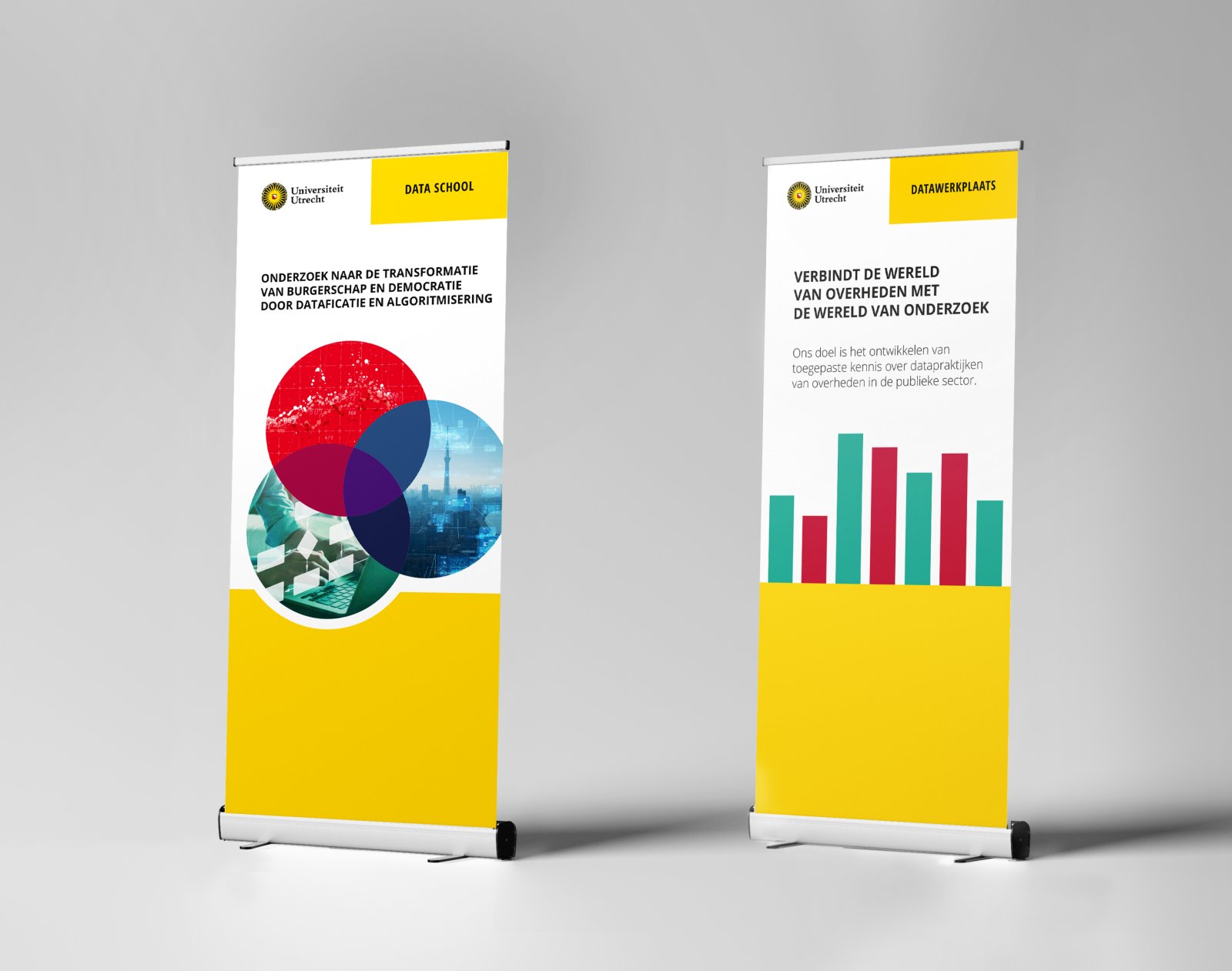
How do you show your unit? Not with a logo, but with a sender block instead.
Use the Utrecht University colour palette and typography when setting up the block. Dependent on your layout needs, you can use a horizontal or vertical version.
Never use more than two blocks in your communication materials: one for Utrecht University and one for your unit. If there are multiple relevant units, you need to communicate this in another way. Not with three blocks, but by mentioning the units in the copy itself. You use the sender block for all communication materials (printed matter, offline and online campaigns, presentations, videos, social media avatars, etc.), with three notable exceptions: do not use the sender block on building exteriors and signage, correspondence materials and your uu.nl website.
In many cases it makes most sense to communicate from Utrecht University as a whole. For instance: when we as the Brand Team design a poster to explain the brand architecture, there is no added value in putting our team name on it. After all, this is something that concerns the whole university.
Only use the sender block when you communicate as a university unit and the communication concerns the unit itself.
Don't use the sender block for events or other messages.
2. Branding by means of good content
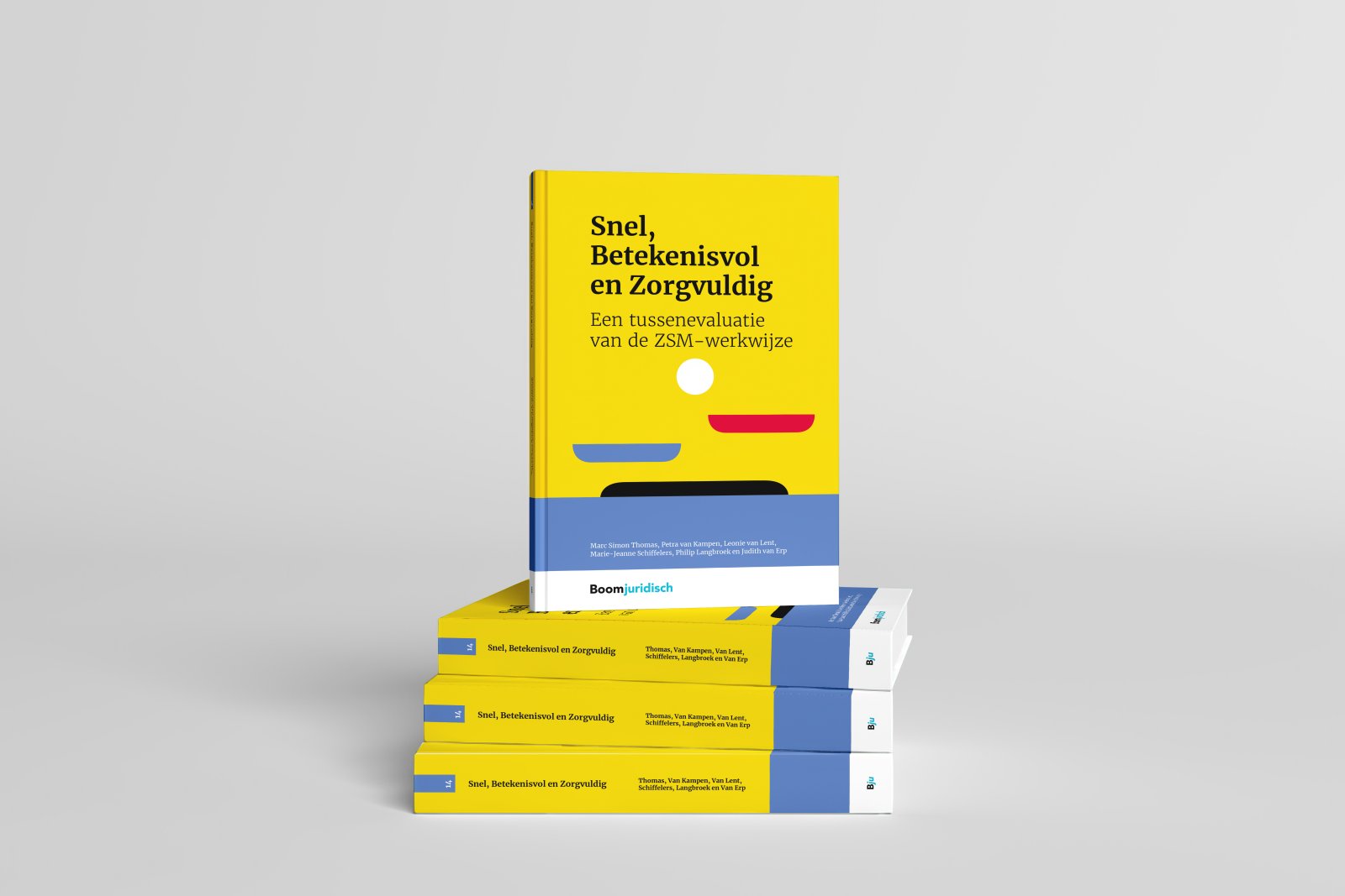
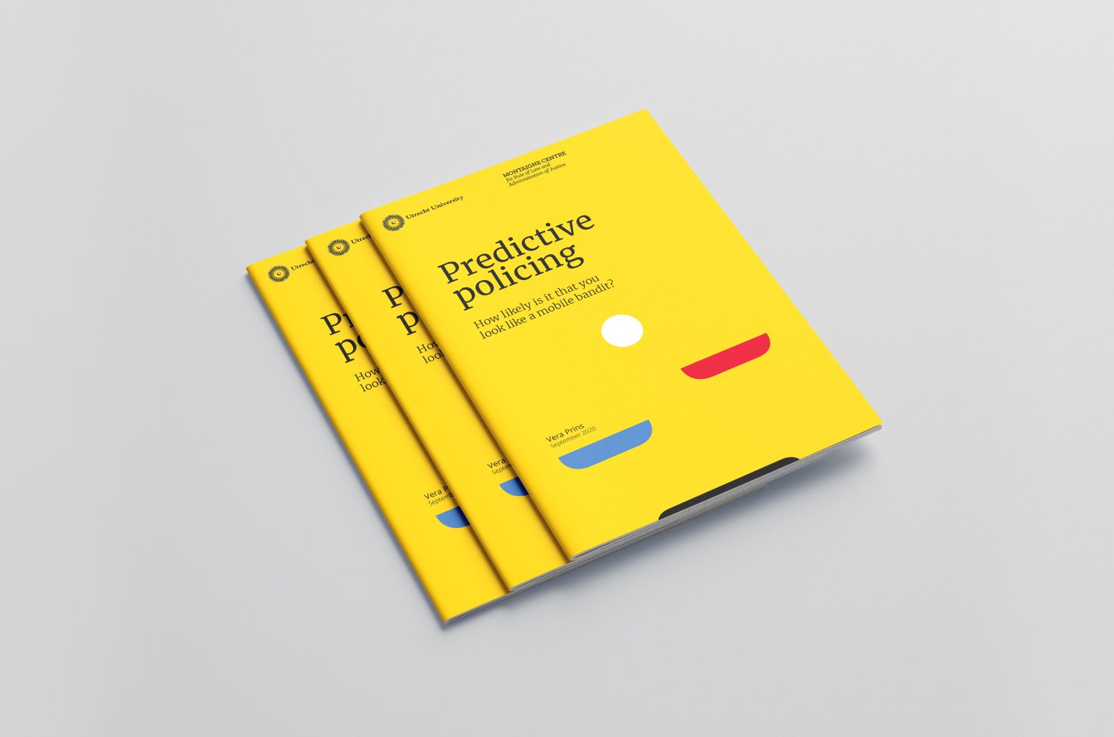
University units have the freedom to create a distinct style, within the boundaries of the main visual identity. Through good content, choice of media, tone of voice and visual language you can effectively brand your unit. When crafting your message, keep in mind our brand identity.
Focus on your message
3. Naming policy: logic prevails
- The name of a unit never includes the word 'Utrecht'. After all, the name is always communicated together with the Utrecht University name or logo. An exception to this rule is University College Utrecht.
- The English name of a unit is written in British English spelling.
- The name of a unit is preferably written in full and not abbreviated. The full name is more informative than an abbreviation.
4. Clarify your partnerships
When working together with external partners, always specify the type of cooperation.
Communication from the perspective of utrecht university
Use the Utrecht University visual identity. Cooperation is important to us, so always include the names of the partners and describe the nature of the cooperation.
Communication from the perspective of the cooperation
If the cooperating organisations are equally responsible, a neutral style is possible. The logos or names of the partners are to be featured on all communication materials, separate from the neutral style.
Sponsorships
If Utrecht University acts as a sponsor, our logo needs to be displayed with the other sponsors. In most cases, the university logo will suffice. If it is important to add the name of a unit, you can use the sender block from rule no. 1.
Examples of sub branding
Centre for Medieval Studies


Teaching & Learning Lab

Montaigne Centre


Data School


